Having friends with benefits
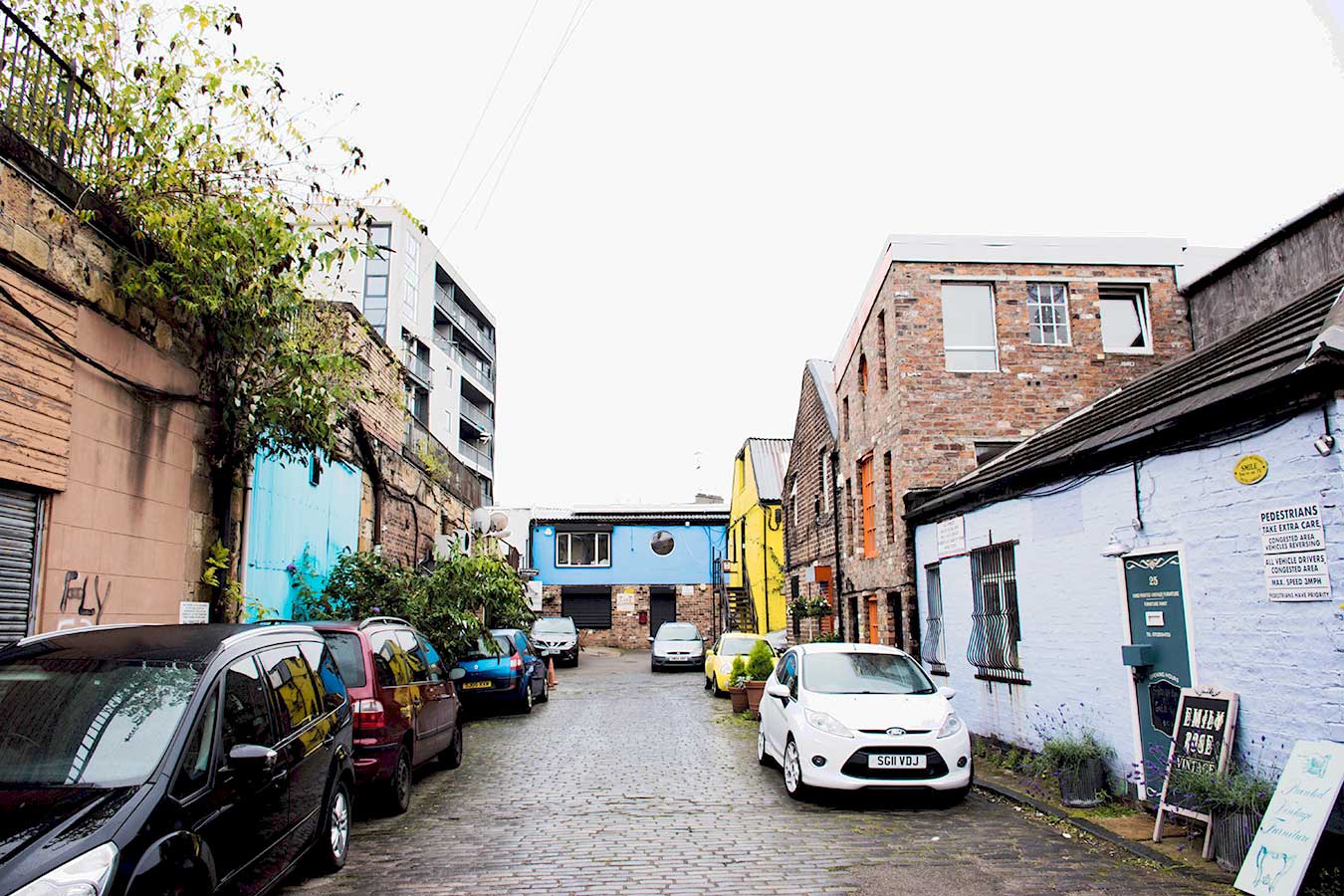
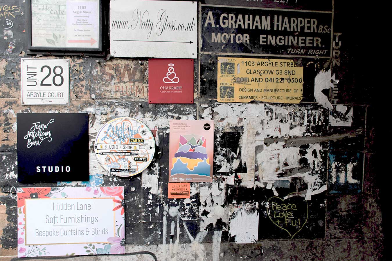
It sounds so peaceful and welcoming: The Hidden Lane. Like an intriguing street just filled with charm. But don’t let the name fool you. The inhabitants of The Hidden Lane are making bold impacts. One in particular is De:strukt, the graphic design studio of Riccardo Chapman.
After nearly two years working for a small design agency, Glasgow based Riccardo Chapman decided to brave the waters of freelance work in 2010. With a studio name in place, Rico worked out of his flat for three months until he hit a wall.
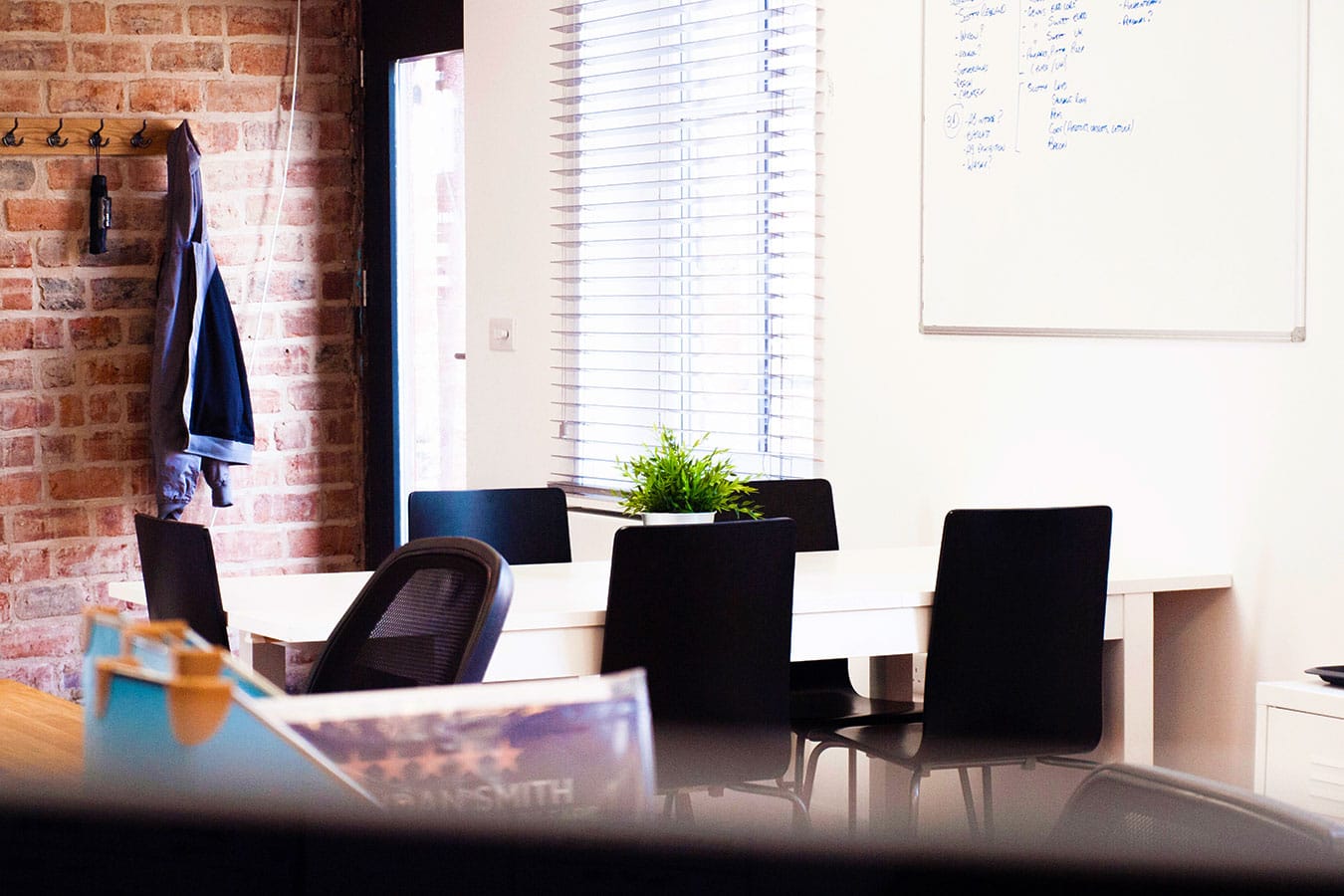
Separating work from home
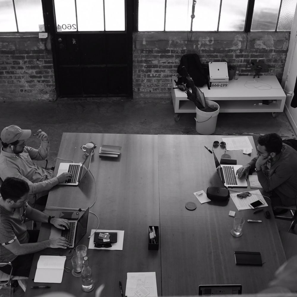
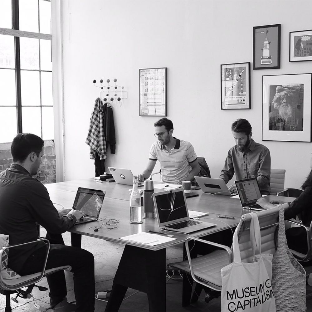
Struggling to find the motivation to get work done, Rico and a friend from university banded together in a search for a dedicated space that would allow them to stay focused. Through a friend of a client, the duo managed to land their first studio in The Hidden Lane, Glasgow's creative community. Eight years later, De:strukt is now a team of 6 creatives with plans for near future growth.
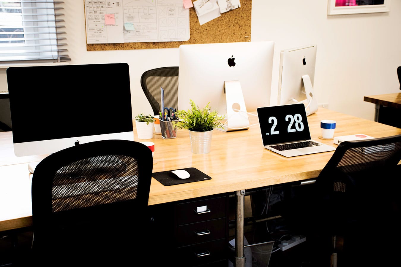
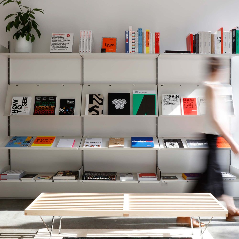
"With our new studio, it’s much bigger and has so much space, so you feel proud to invite clients over. It just gives you that bit of extra confidence."
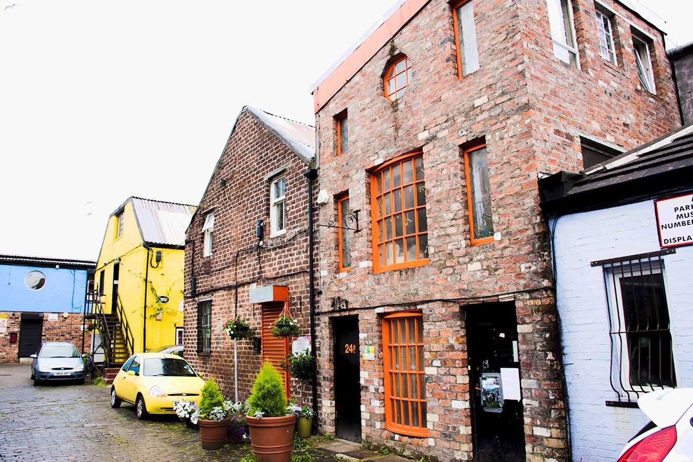
The view outside
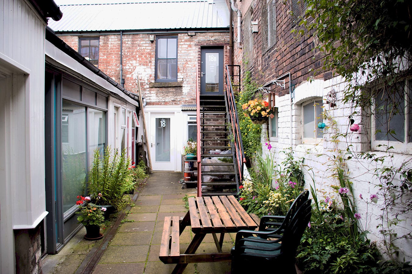
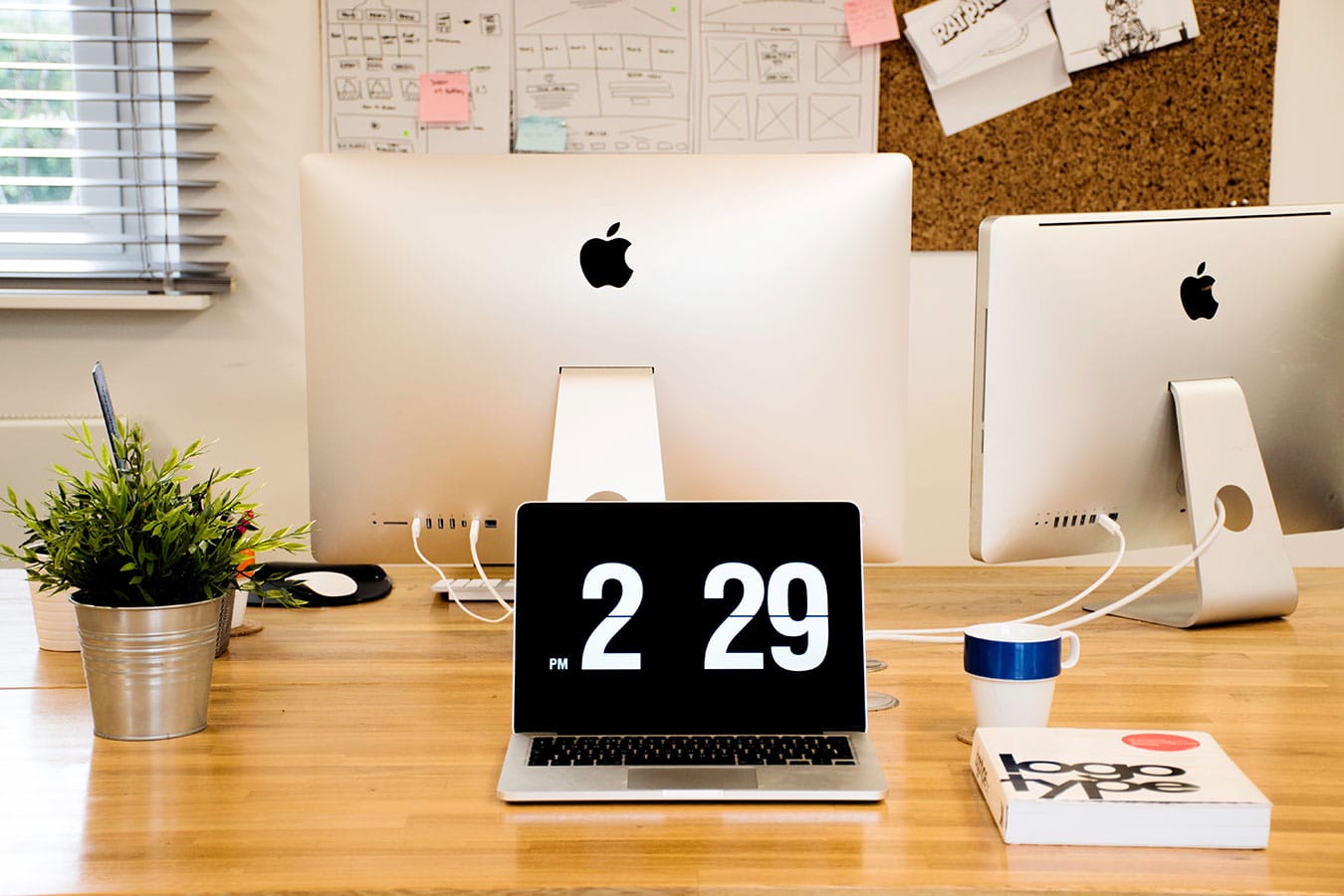
Quite minimal in nature, De:strukt's studio is a contrast from their exterior surroundings. Vividly colored buildings, with a striking black contrast, border the studio and are just screaming out for attention. Influenced by street art, De:strukt artfully surrounds themselves with plenty of street inspiration. It's almost as if the studio is set up as an area to focus, and when ideas are needed; just step outside and explore The Hidden Lane.
A unique offering
Feeding off of his passion for street art, Rico decided to offer mural installations as a service. In the early days, it was a means to set De:strukt apart from the competition. At the time no other Glasgow agency was offering this as a service. Since then, many studios have caught on, bringing a healthy dose of competition.
Treating a mural installation as any creative project, Rico told me they always begin with a creative brief. After narrowing down the project direction, an artist sketch follows soon after and then it’s off to painting. Impressively enough, all of De:strukt’s installations are painted free hand. The only time they use a stencil is for logo placements. After the outline of the artwork is laid out, De:strukt spends a lot of time filling in the color and adding texture.
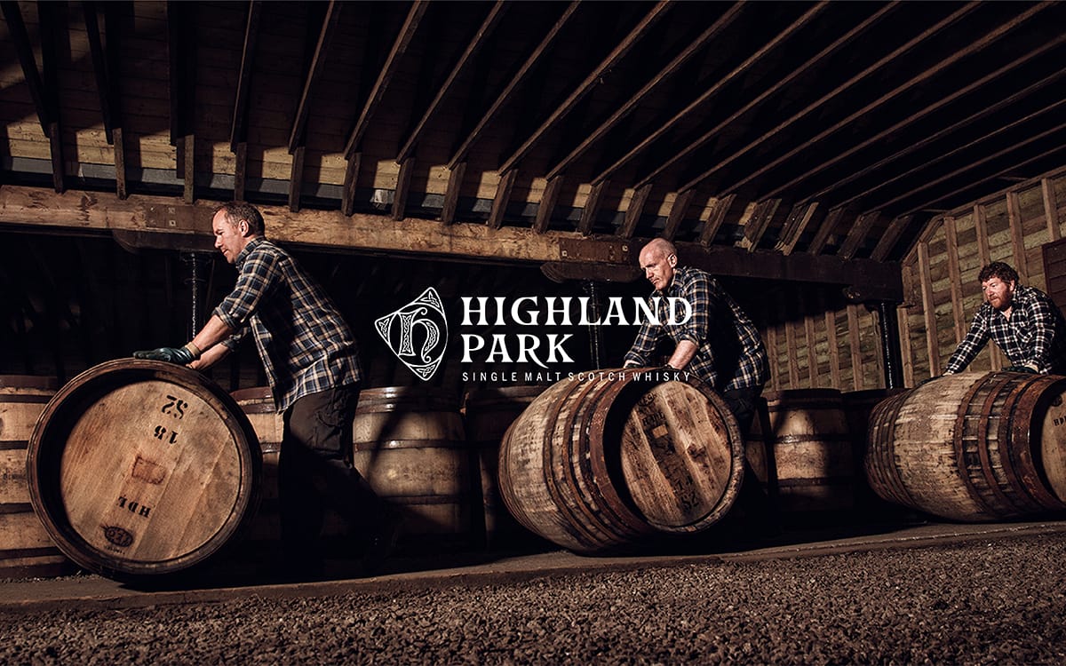
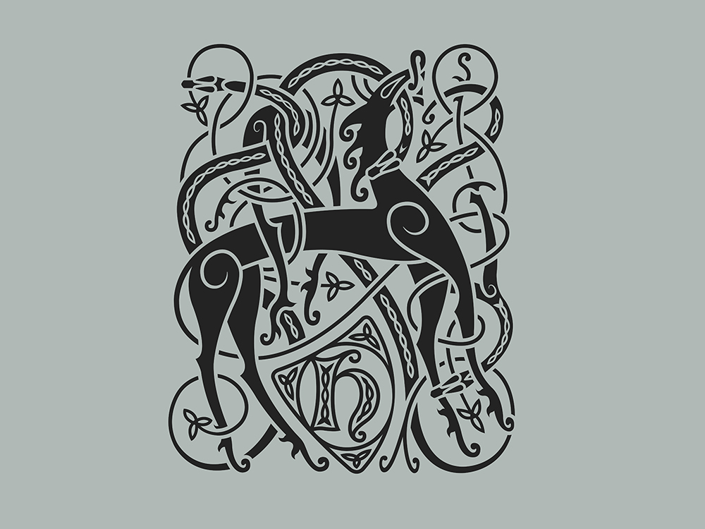
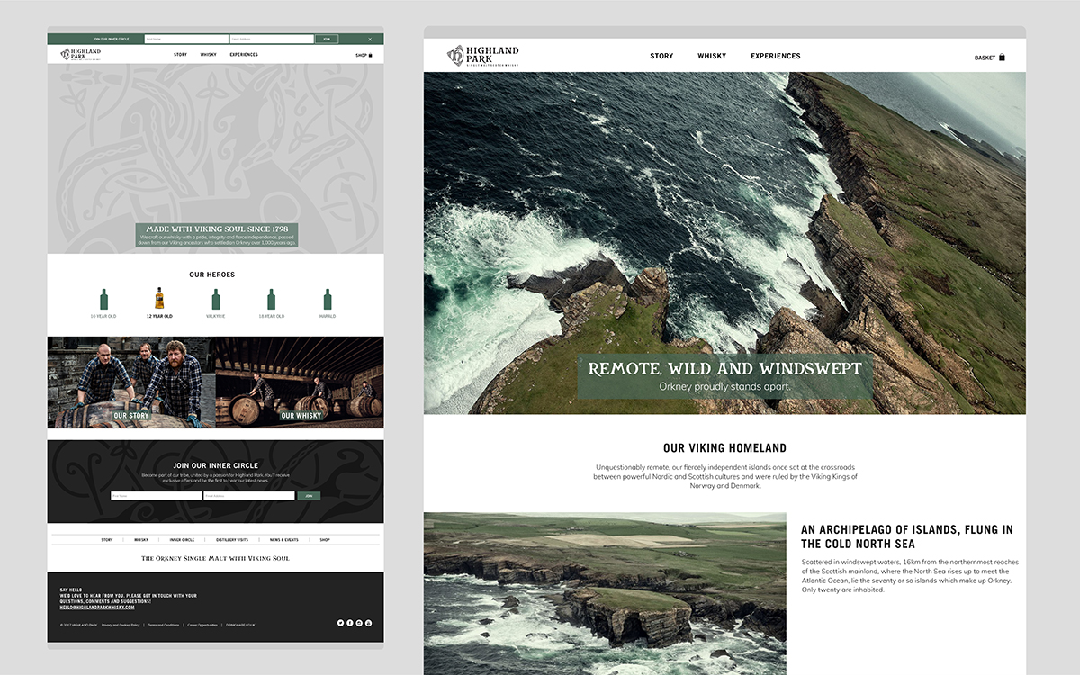
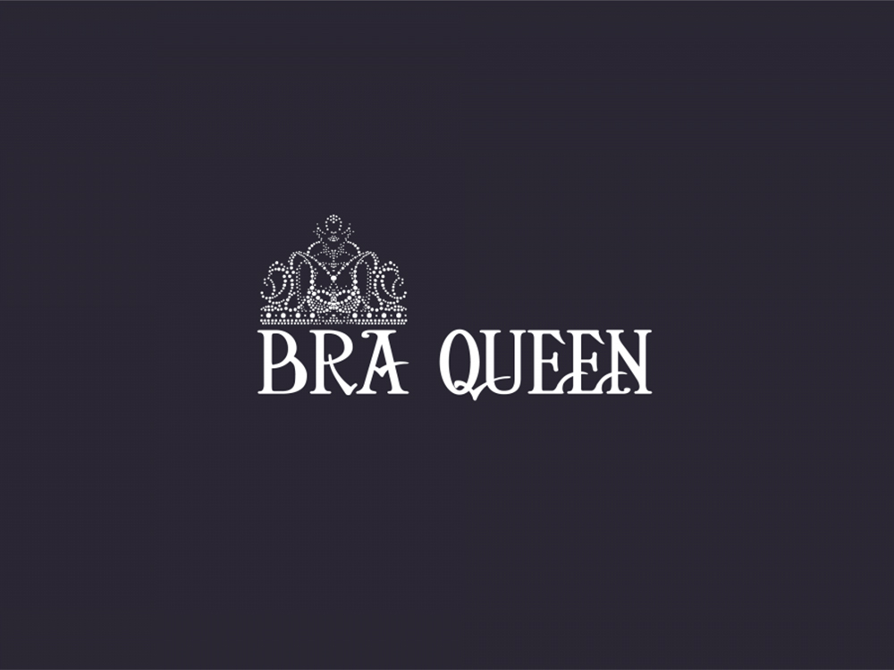
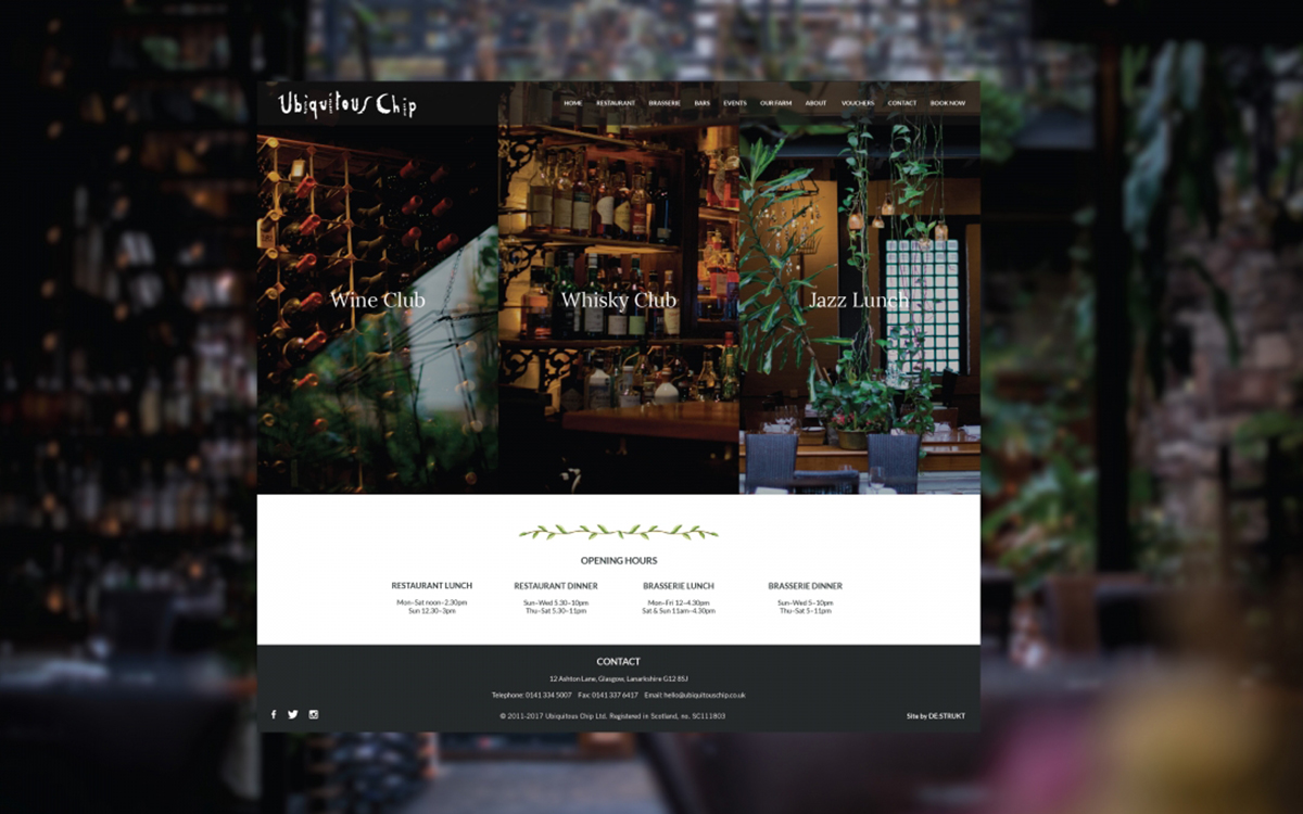
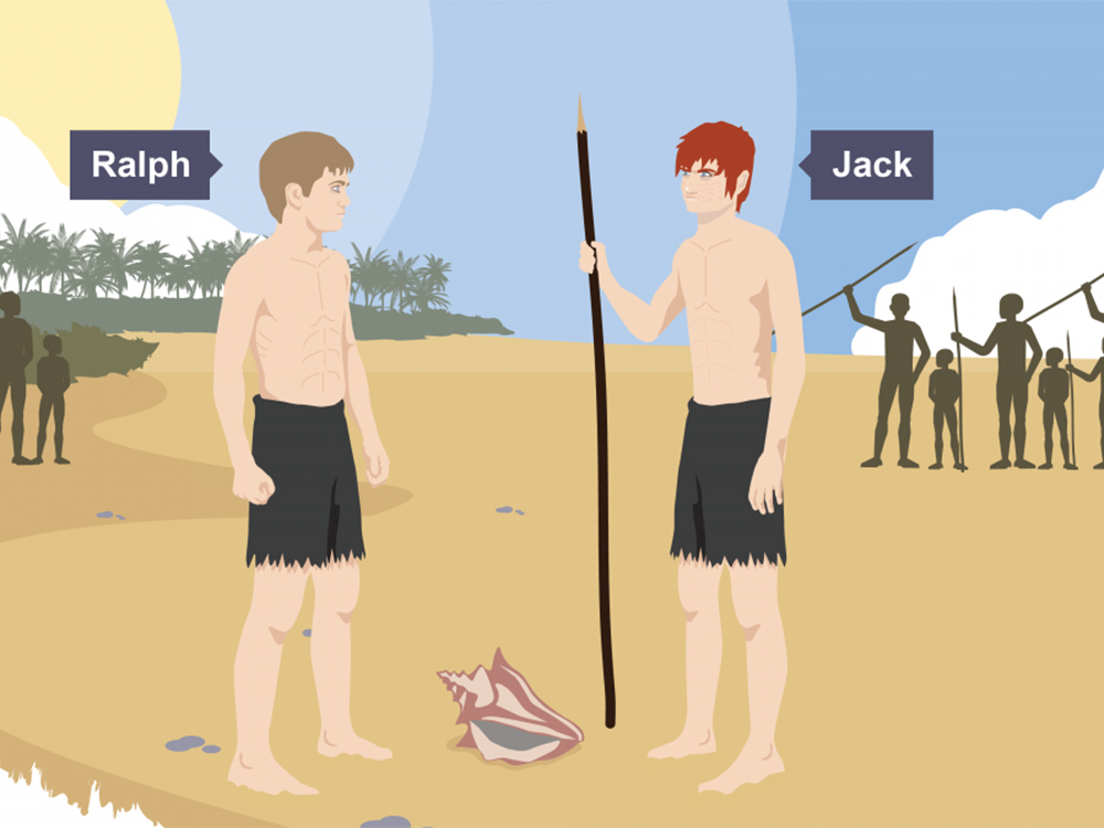
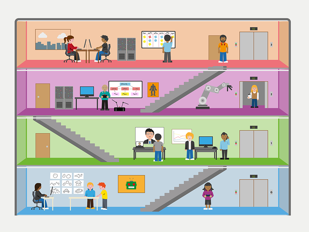
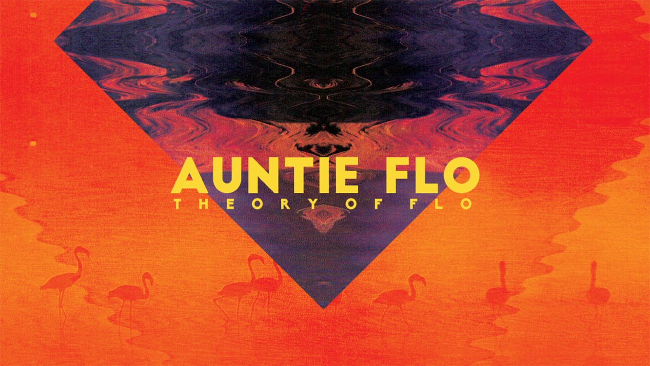
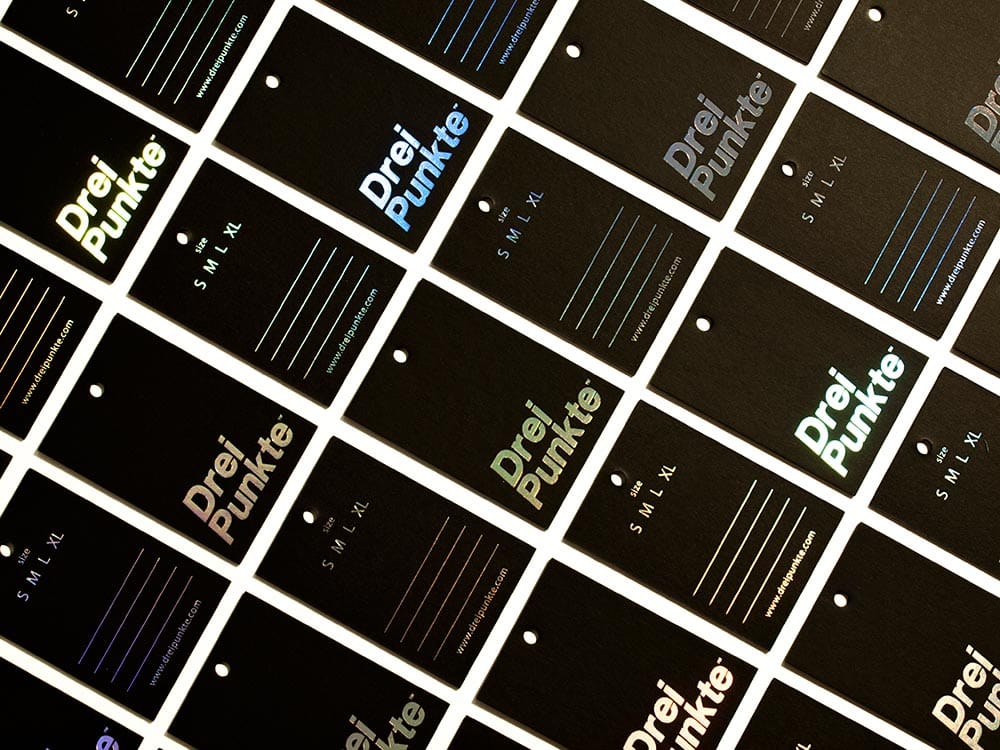
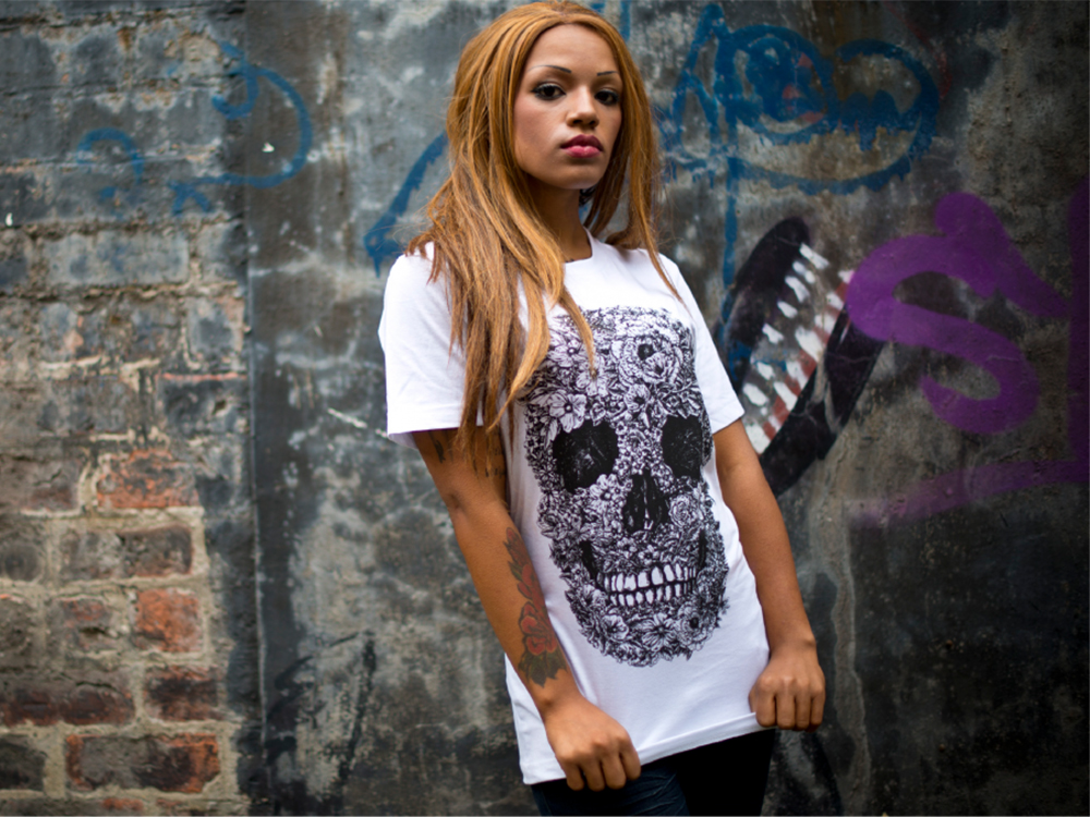
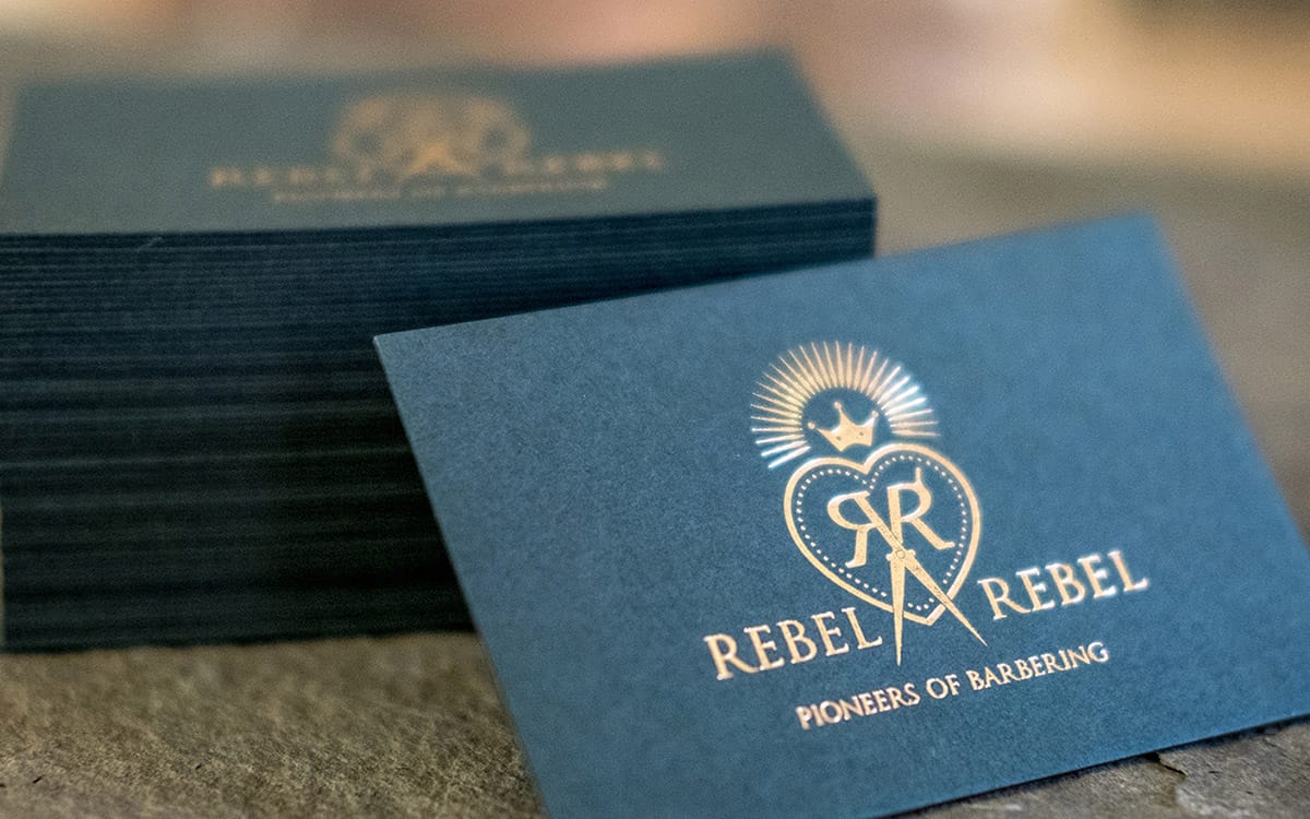
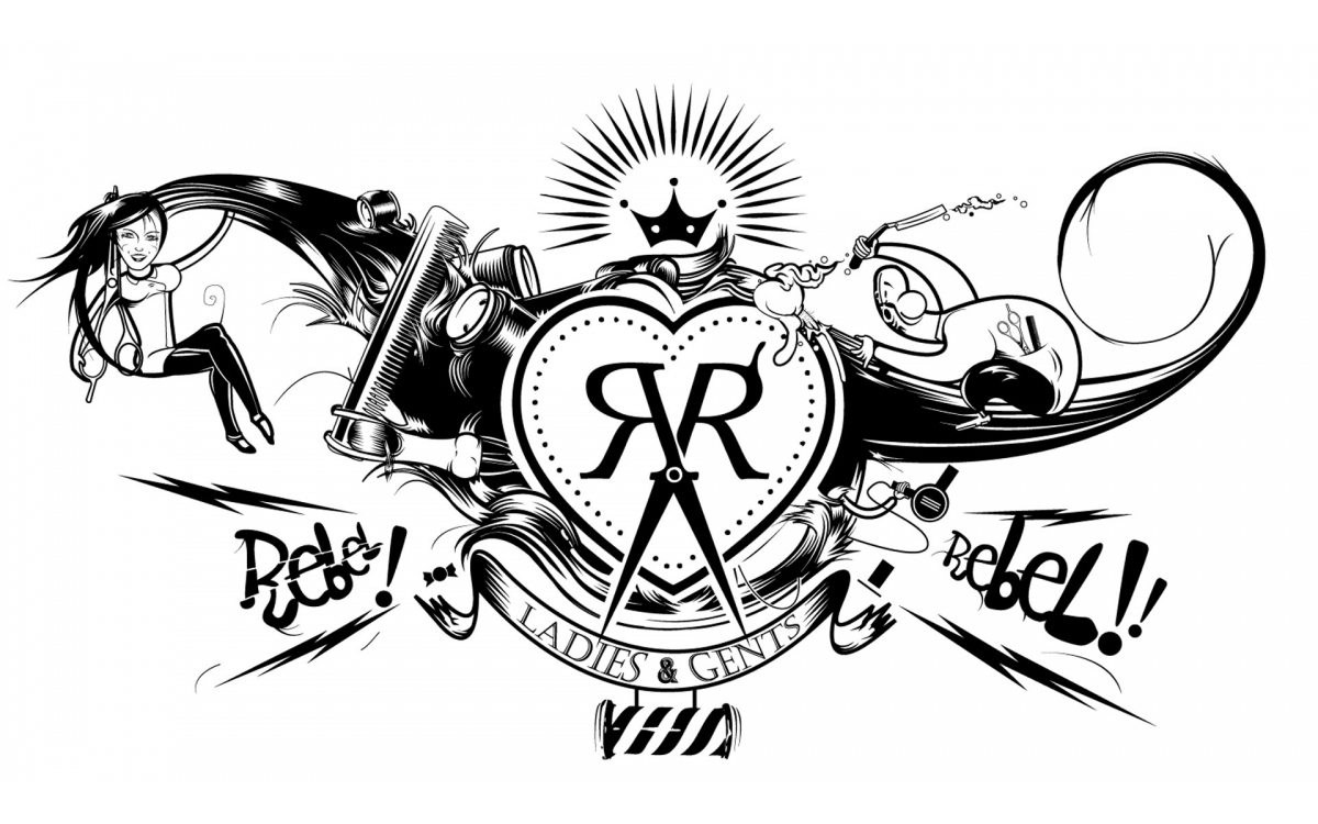
Having BBC as a client for over 3 years allows for some nice clout in a portfolio. Illustrating characters and objects with large blocks of posterized shadows, De:strukt has kept a consistent and playful feel for every BBC campaign. There is a distinct raw and unkept feeling to every illustration that blends in the signature De:strukt flair. While Rico told me he felt De:strukt doesn’t have a house style, I definitely sense a somewhat grunge prescience in all their solutions. Whether it be the Celtic inspired logo for the brewery Highland Park, or the jeweled patterns for the women’s lingerie provider Bra Queen, there is this subtle notion of De:strukt’s street art inspiration. Even the elegant logotype for LUTTI has some serious attitude to it. The identity for Drei Punkte, a street culture fashion label, balances clean communication with a vibrant application. Pair this solution with the edgy product photography and you get a clear representation of style De:strukt brings to the table. Projects in order of appearance:Portfolio Review
Living results
Highland Park, Bra Queen, Ubiquitous City, LUTTI, BBC iWonder, Auntie Flo, Drei Punkte, Rebel Rebel, Volution Music, The Furlong Collection
Word of mouth
Being tucked in The Hidden Lane allows for easy access to collaborate with other creatives. Whether it be for simple favors, commissions, or referrals, these local creatives are an extremely valuable asset to Rico. It's one of the many great perks of having a smorgasbord of creatives right outside your door.
De:strukt's website: destrukt.co.uk
De:strukt on Twitter: @destruktstudio
Photography courtesy of De:strukt.
