November 2017
A walk to solve all your problems
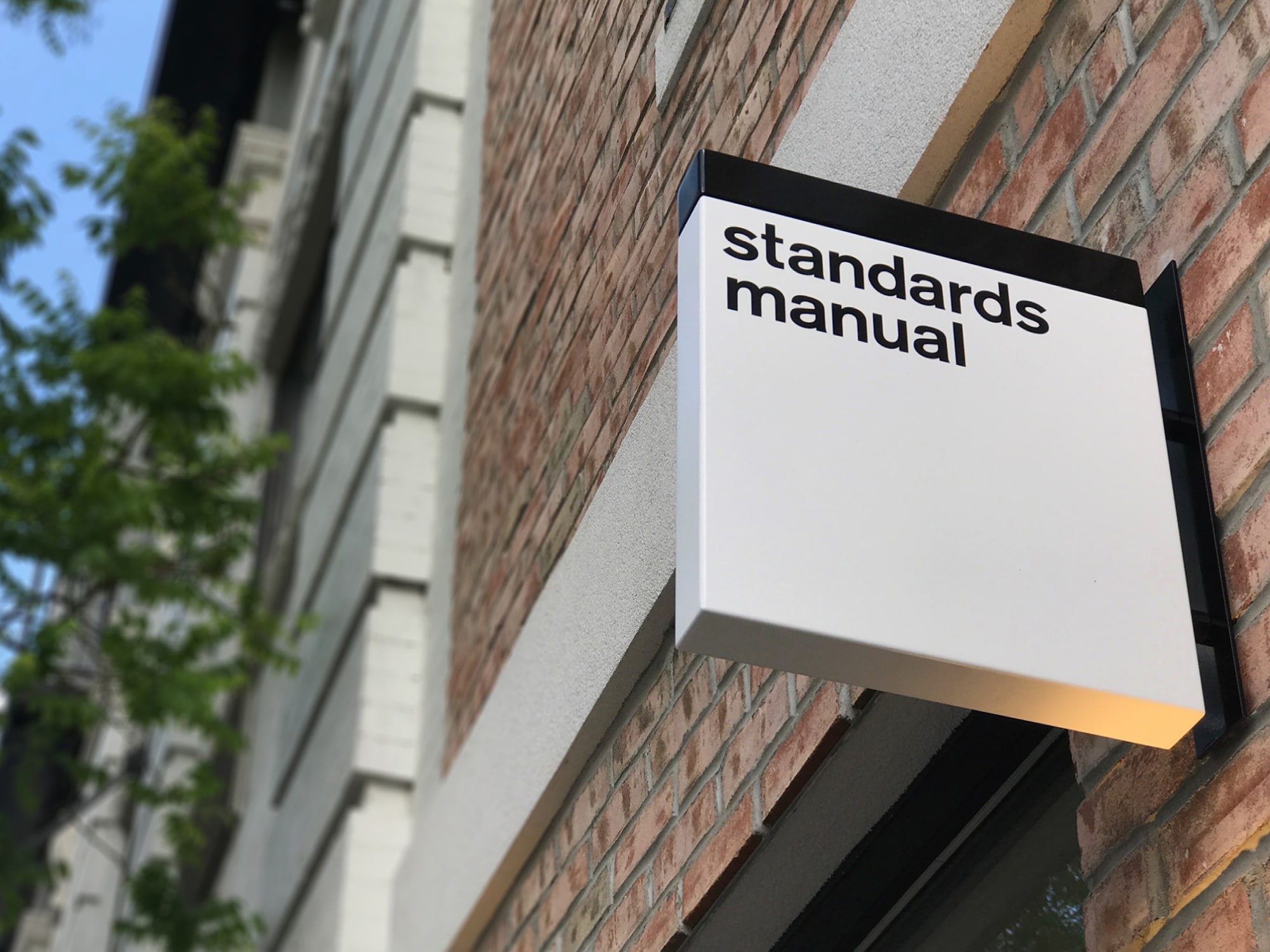
While working at Pentagram, designers Hamish Smyth and Jesse Reed stumbled upon a copy of the New York City Transit Authority Graphics Standards Manual in Pentagram’s basement. Realizing they just found graphic designer’s gold, Hamish and Jesse were quick to take action in reproducing the book. A successful Kickstarter campaign later, NYCTA was reprinted. Both having a keen desire to make things happen quickly, the pair developed a close working relationship and their imprint, Standards Manual, was born.
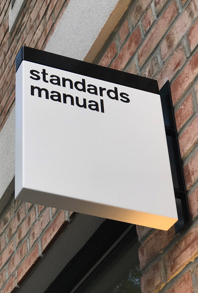

They didn’t stop with the NYCTA reissue. Two more successful Kickstarter campaigns saw the reissue of the NASA Graphics Standard Manual and the 1977 EPA Graphic Standards System. Recently, they published their first non-manual reissue with Objects, a collection of 400+ found objects of the photographer Brian Kelley. But before the release of Objects, the duo knew working weeknights and weekends were becoming too much to handle.
Very romantic
The idea of establishing their own design studio came to fruition in Atlanta, Georgia where Jesse and Hamish were at a speaking engagement. During a walk in a park, the duo was talking about their career paths and found their time at Pentagram was nearing an end. Feeding off the success of Standards Manual and the knowledge acquired while at Pentagram, they both knew it was time to strike out on their own.

"That’s the key to a partnership: trust. Cliche, but for a reason. Just like that sentence."
Wanting to name their studio “everything” based on Vignelli’s mantra, they found the name was already taken and didn’t quite fit them. So, they looked into how they approach design and found they are orchestrators of order. It was a unanimous decision. Order. Within twenty minutes they had a name, quickly bought domains and configured email accounts. It was time to head back to New York to find a studio space.

Now taking orders
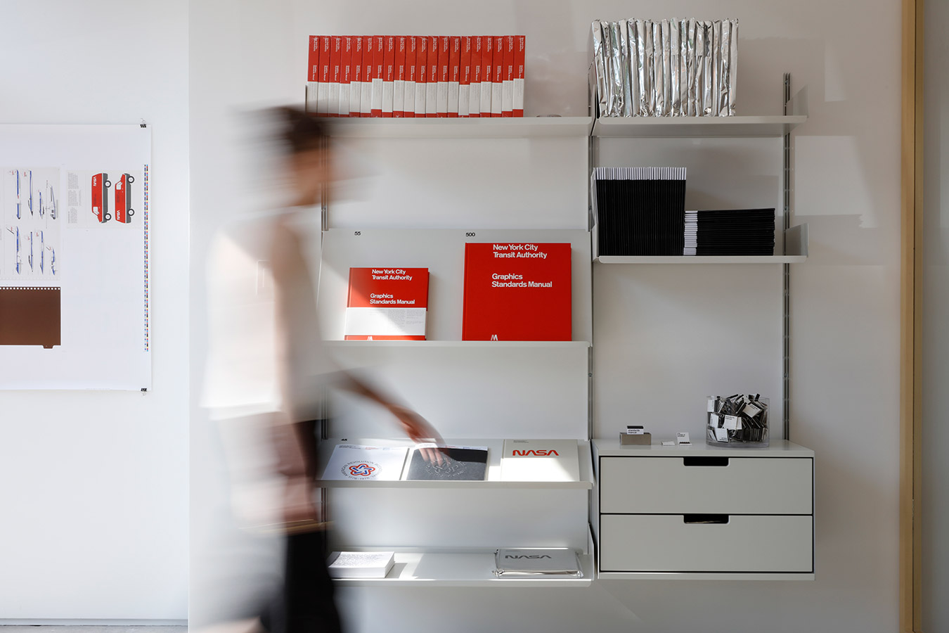
While discussing the studio affairs, Jesse and Hamish toyed with the idea of having a ground level space for people to walk-in and explore their Standards Manual books. Trying to find a means to make this possible, the pair arrived at creating a bookstore that would specifically focus on graphic design books—while order would be situated in the back of the building.
Initially searching in areas of Manhattan, the prices for the space they needed were unfavorable. Not succumbing to defeat, they started preying in their home neighborhoods of Brooklyn. While walking to visit a possible space—a lot of good things happen when they are walking—they saw another space was available and it was love at first site. They aggressively signed the lease and the renovations started.
Everything is in order
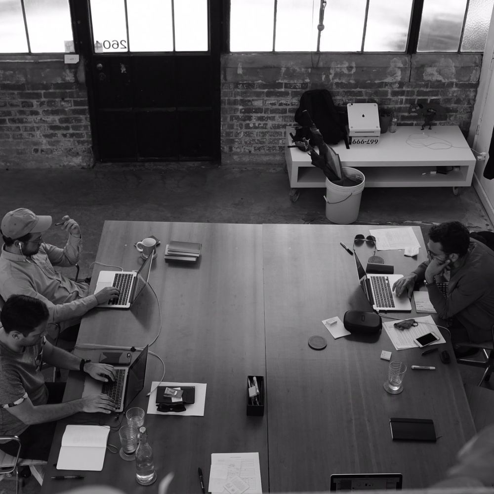
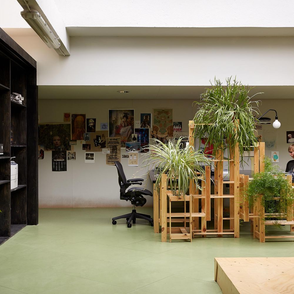
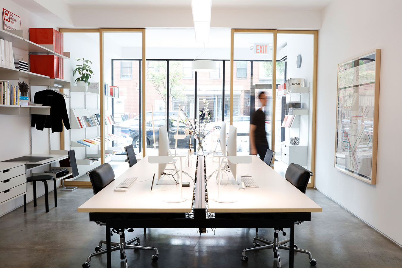
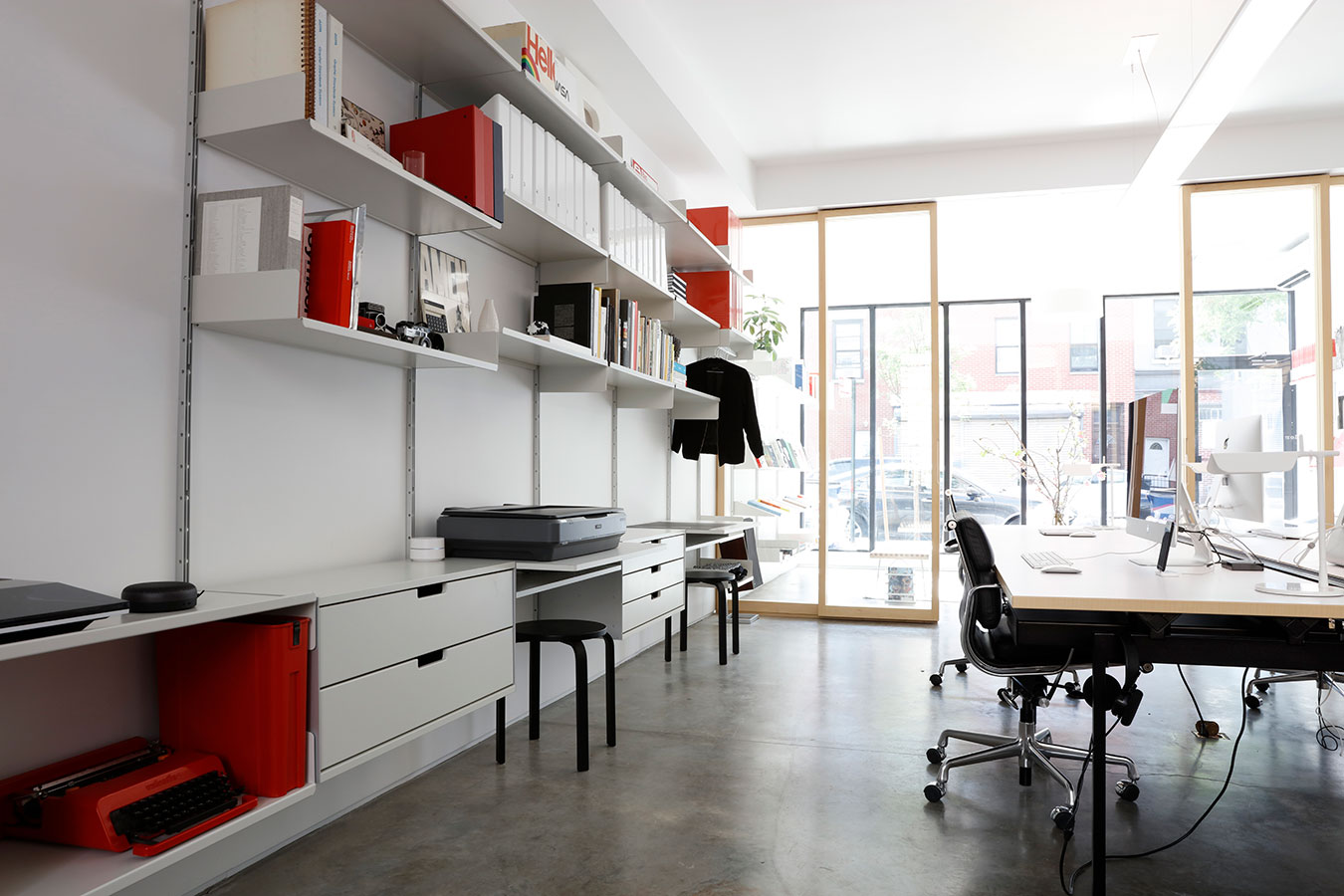
Because of the decision to have Standards Manual be the storefront, the Order side of the studio is visible through large glass partitions. This gives the public a chance to look in and see the studio in action. From the outside, it almost appears as a small library filled with books and computers for research. It’s a unique setup that I’m certain intrigues people walking by.
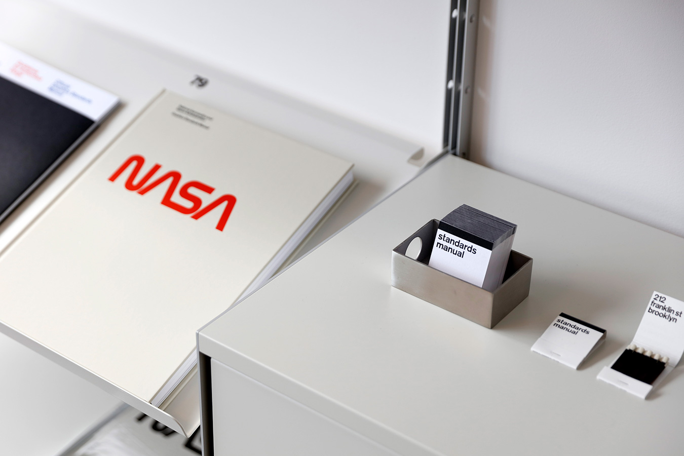
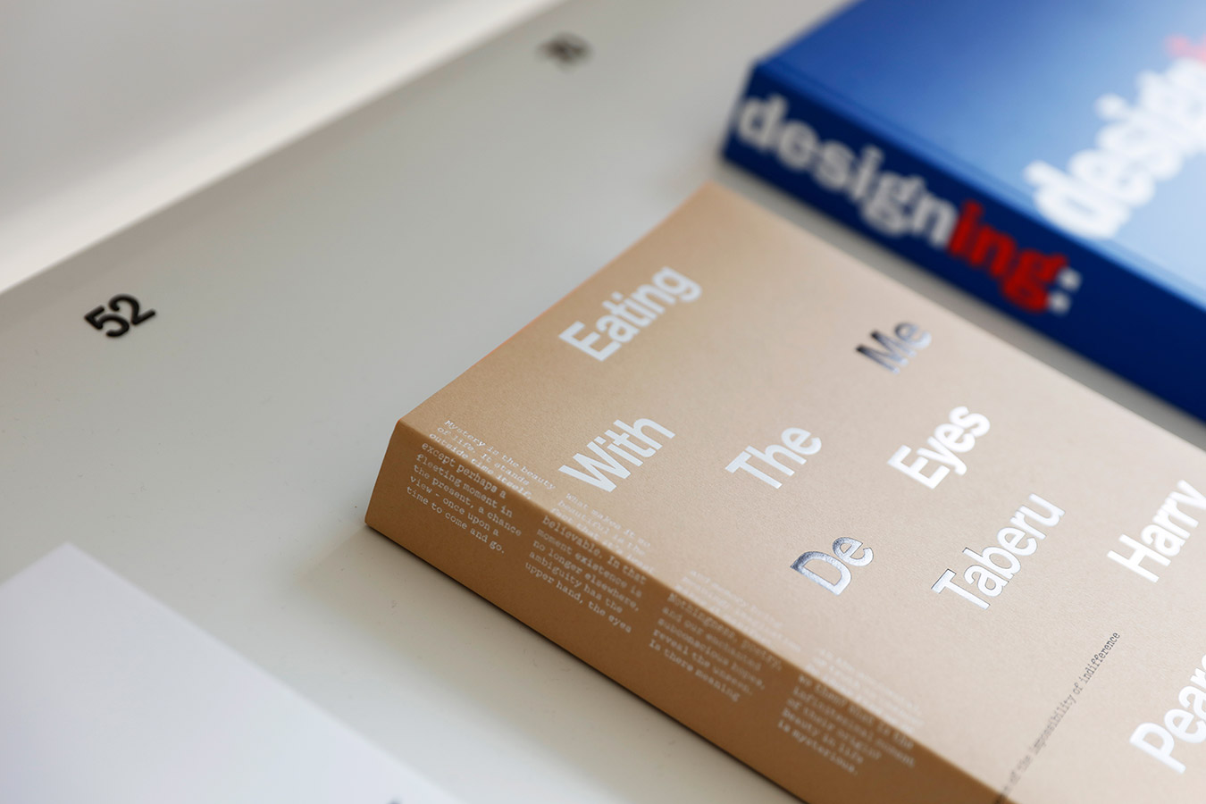
Clear organization is noticeably visible in their studio. If the tidy desks weren’t a dead giveaway to Order’s ethos, the Vitsoe shelving system should speak wonders. Even the minor details paint a clear picture of their ordered approach: the catalog of books on the shelves, the minimal acrylic price tags, and the presentation of the book display copies.
"If we’re both equally stoked on something within the first minute of discussing it, our enthusiasm trumps any doubt."
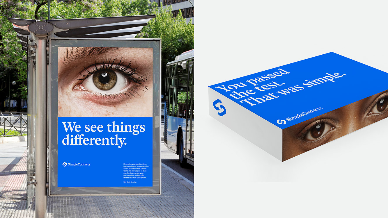
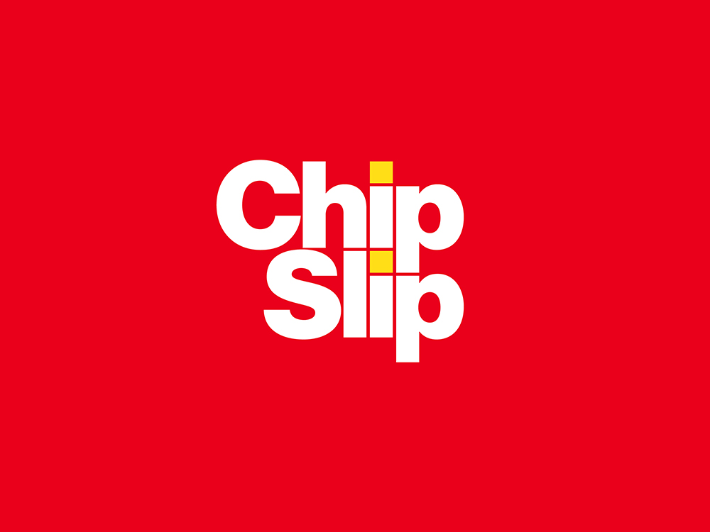
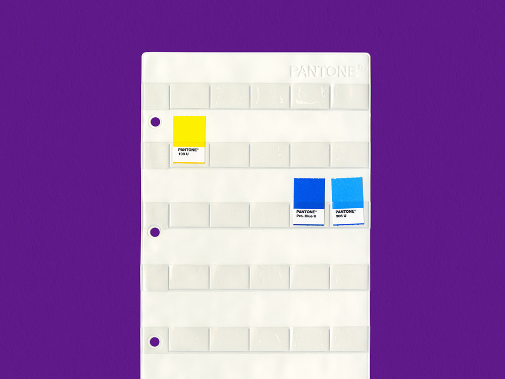
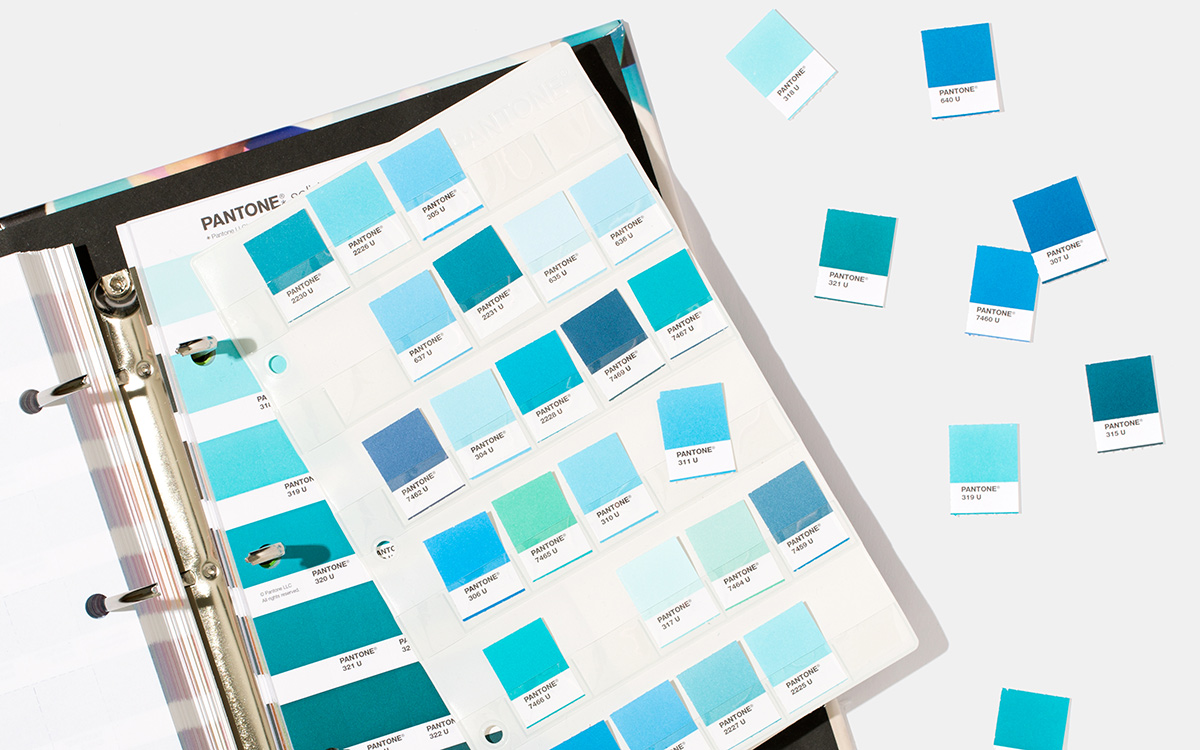
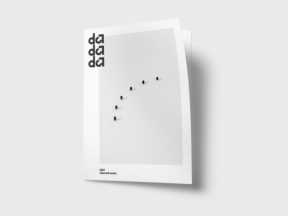
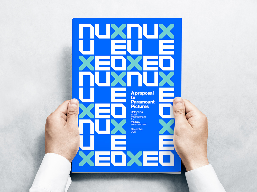
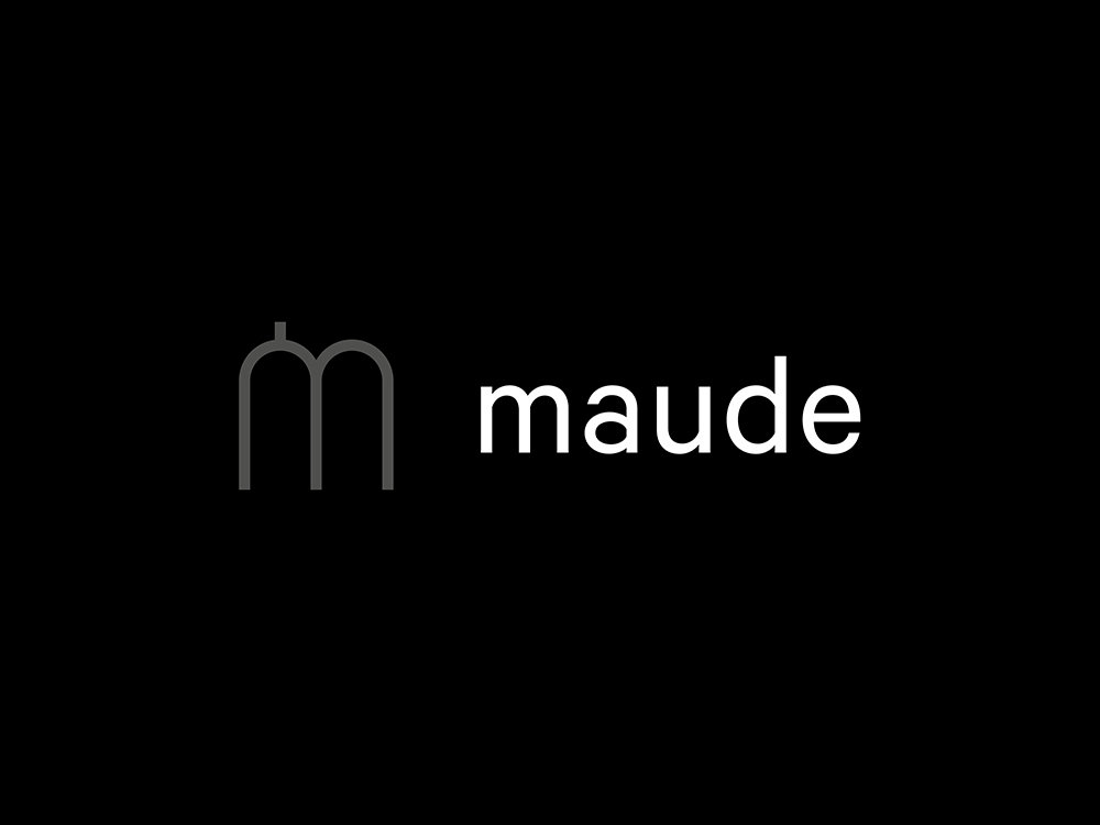
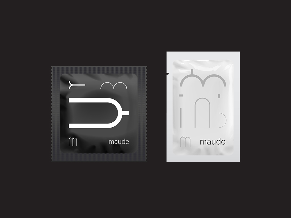
With Order being a young studio, their current projects have yet to be publicly released. Instead of showing the impressive work the duo completed while at Pentagram, Order kindly shared a sample of their work to be completed heading into the new year. Having talked with Order prior to seeing their work, I knew I was in store for some very well positioned solutions. The Underline, a project to convert the land below Miami’s Metro rail into a 10-mile urban destination, clearly and literally communicates itself while remaining simple and clever. Even the thicker weight of Lineto’s Circular plays off of the chunky concrete pillars that line the Underline. Playing off the logotype to communicate in the simplest of means, Chip Slip, a plastic sleeve to organize loose Pantone chips, converts the dot in the “i” to represent Pantone swatches. Even the small details are loudly evident with the Pantone dot “i” being vertically aligned as if they were actual chips sitting in their sleeve. I can see it being pushed even further dynamically where the Pantone dot “i” changes swatch colors. Maude, a company providing simple and easy access to sex essentials, is quite an interesting client. I’m sure Order’s browser history during the research phase was filled with suggestive material. Arriving at a titillating monogram, each piece of the “m” is chopped, cut, dissected, and depicted as if I were reading Kama Sutra. I’m not sure if designing a condom wrapper was a project they foresaw in their pipeline, but it certainly makes for an interesting skill set. Projects in order of appearance:
Portfolio Review
Living results
The Underline, Simple Contacts, Chip Slip, Nuxeo, maude


Taking it to the next level
While Order is a young studio, its founding partners are seasoned designers who have the studio destined for greatness. If you catch the pair walking on the beach don’t disturb them. They’re probably cooking up something great.
Order's website: order.design
Order on Twitter: @order
Photography courtesy of Hamish Smyth.