Mark Fleming, Chief Creative Officer
Having moved from Birmingham to London for college, Mark Fleming established himself as a creative force at a few different London agencies. Growing tired of working on projects that didn’t enthuse him, Mark and his business partner started Rosie Lee using a spare bedroom as their office. Now with 30+ employees and 4 studio locations, Mark talks to us about designing the Rosie Lee London studio, transitioning into retail design and much more. This interview was conducted via email in December 2017.
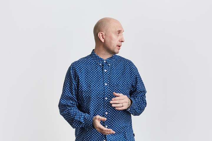
When Rosie Lee started in 2001 you used a spare bedroom as the office. It’s in this makeshift office that you were working on your first campaign for Nike. How did you manage to secure such a large client in the early stages of Rosie Lee?
Back when I was working at my previous agency I’d been introduced to a couple of people at Nike, who were interested in collaborating when they found out I’d started up Rosie Lee. Ultimately, I don’t think it’s all that difficult to win a project or two from a big client. What makes our relationship with Nike notable is the fact it’s been going 17 years now and they keep asking us back. It’s a one-night stand versus something more serious.
Were there any nerves or doubts about being able to deliver to such a large client?
Oh yeah, absolutely. Because Nike and people within the Nike team were willing to work so closely with us, it really helped in terms of making those initial campaigns go smoothly. It also helped that what we were working on was just beginning, which allowed us to grow with it. We had to be the foil for some really great and iconic Nike advertising, and try to evoke the same feelings across photoshoots, experiential pieces, and retail installations.
Rosie Lee wasn’t the first studio you started. What did you learn from your first attempt at setting up a studio?
The biggest thing I learned was how important positioning was when it comes to offering clients your services. I feel like my first agency fell into a bit of a niche in that we only seemed to do boutiquey, high-end stuff, which was nice but came in too infrequently. Looking back, not many of the boutique agencies from the period are still going now.
When I set up Rosie Lee I was very keen that we did work that was concept-led, rather than centered around a particular aesthetic—aesthetics tend to fall in and out of fashion and are easily replicated—while developing the ability to work principally from distinct ideas allows you to evolve and adapt far more easily.
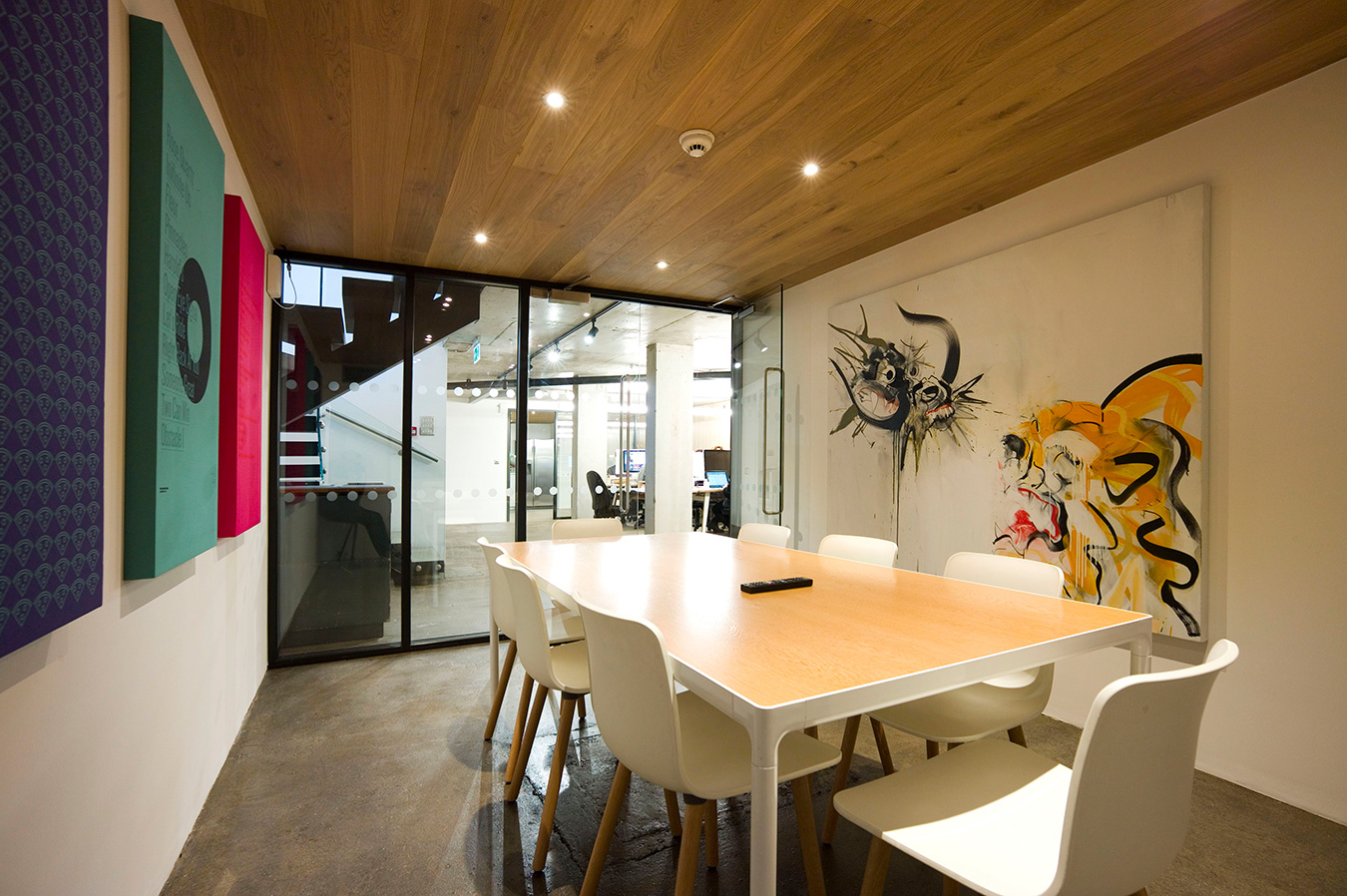
Last year you moved into a beautiful new office space in London. Why did you move studio spaces? Was it an easy process finding this space?
The team had recently expanded so we were looking for somewhere new. When we heard that a space in a new building was opening up on Kingsland Road, it felt like too big an opportunity to pass up. There was previously an abandoned pub on the land, so we kept its signpost for our sign.
We’ve been in East London since the agency was founded. First in my spare bedroom on Haberdasher Street, then in a couple of offices on Hoxton Square back when it was a bit sketchy. We never really thought about moving elsewhere. The area has changed immeasurably over the past 15 years, but I still love it. We never wanted to be one of the West End agencies, and our staff was very settled in East London.
In today’s digital world, how important is a studio’s location? I often wonder if studio location is a major factor in success since communication platforms like slack and Skype are so advanced.
We’ve had to think about this a lot as we’ve opened up our new offices in Amsterdam, New York, and Frome over the past few years. I think—for the moment at least—location does matter for face to face contact with clients, freelancers, and suppliers: all of which are really important. In terms of actually doing our work though it’s less crucial.
Your studio space is extremely well polished and tidy; however, there are these striking details that really create a memorable visual. The distorted logo on the windows, the illuminated bookshelves, the meeting room artwork, and the colorful sneakers to name a few. Do you feel this studio ambiance is similar to the creative output of Rosie Lee?
Trust me, it’s far less tidy now. It’s great to be able to display so much stuff we’ve worked on and are proud of though, and it definitely informs the work our designers do now. One thing we did consciously include when we designed the space was the painting we commissioned to hang downstairs. It was done by our friend Dave White back when we were in our old studio, and it represents the duality of what we do; both the creative energy of our designers and the work of the rest of our team in delivering it. Which is the dragon and which is the tiger is up to you.
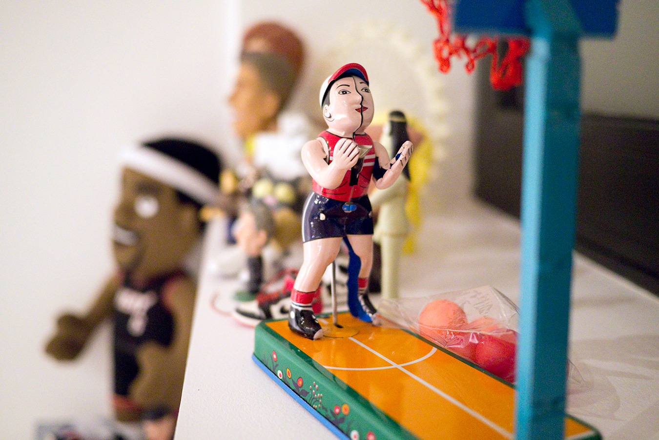
I was told that you designed the new studio. Very impressive.
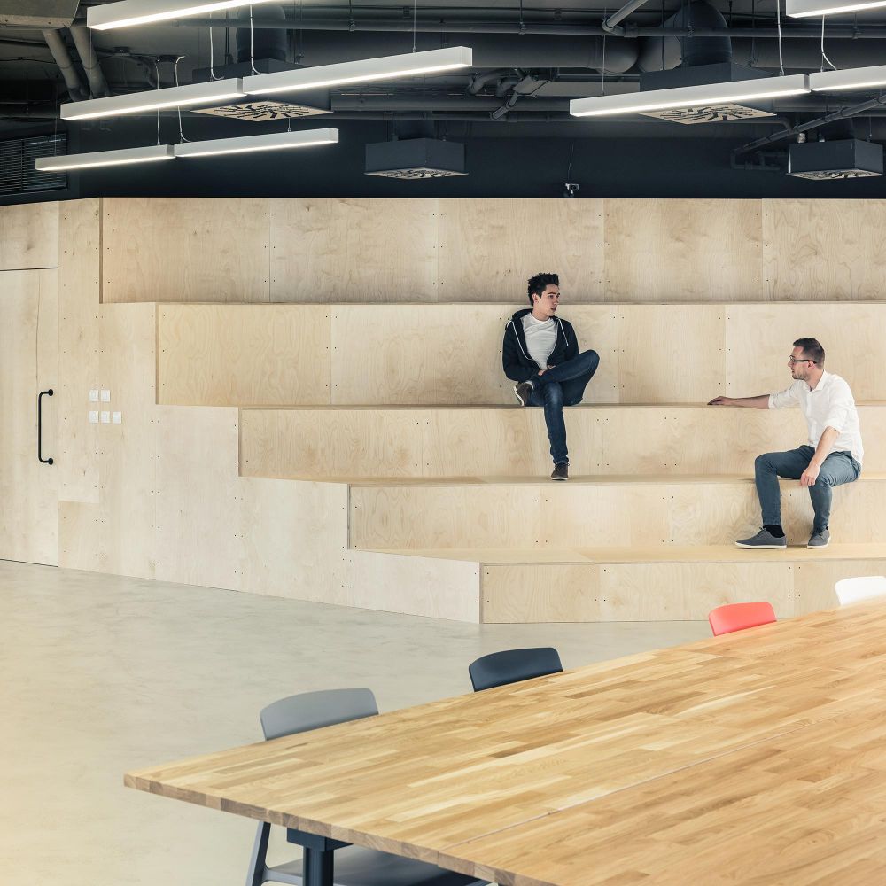
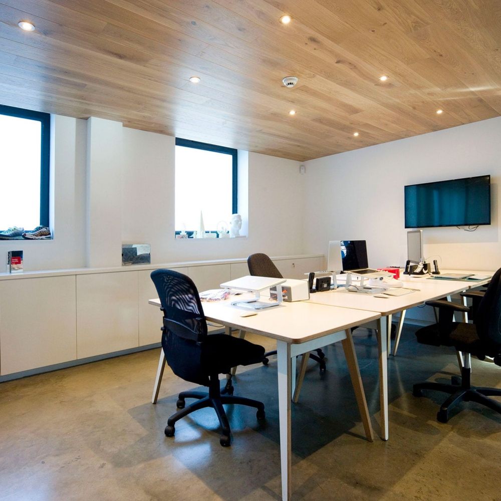
Cheers. The office was a shell, so we were able to pretty much arrange it as we wanted. I knew what I was aiming for, but balancing aesthetics and a practical working space were tricky. We learned a lot doing it. Mostly that human behavior can be tricky to manage, i.e. encouraging collaboration, and time away from desktops, and creating an atmosphere can be tough.
Creatives, because they tend to be loud vampiric and unruly, are downstairs in the basement, which allows them to be as crazy as they like. The amount of storage we have down there is useful, so they can hoard if necessary too. Our project teams are upstairs, which gives them a quieter space to work in. In terms of looks, we’ve tried to combine hardwearing neutral elements with splashes of color, like the bathrooms and our front window vinyl. I like that it has just enough character to not have a particular character.
With your creative department and project teams separated, do you have a management software you use to keep everyone on track?
A couple of years ago I moved to New York to set up our fourth studio in the US, which precipitated the need for us to find a piece of software that would allow us to work smoothly across time zones. We’re used to collaborating with our clients in China, the UAE and elsewhere, but it’s a bit different when it’s your own team. There needs to be something to keep projects organized when face-to-face contact is less possible. Trello works for us because it allows us to pull in all the other services we use like Google Drive, and it uses principles from agile development. When we added a full-time digital team, they were used to working that way and it made sense to transitions to our other departments.
Rosie Lee is a unique name.
I like tea. Rosie Lee is the cockney rhyming slang for it. It does also make me think of a few different things that I appreciate, which is probably why it has endured. I’ve always been conscious of the fact that everything we do is a collaboration, and relies on the work of numerous people with different skills. In that sense, I appreciate the idea of the blend and balance of different leaves that makes tea. There’s also the fortune-tellers and tea: leaf readers that used to use the name "Rosie Lee", which chimes with the fact we think we’re quite forward-looking and proactive as creatives and as an agency.
You develop a lot of retail designs. How did Rosie Lee fall into offering retail design as a service? Is there a background in interior design?
Not really. The things we were doing previously, brand storytelling in a cultural context, translate really well to interior design, and as a result; it’s something people have sought us out for. When you build a company’s office or brand spaces, for example, the thing that makes them feel like home are the little anecdotes and insights that have grown with the company and have built its legacy. Because of our past projects, we’re well placed to explore them.
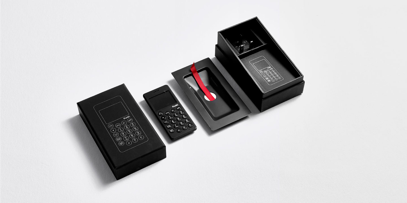
Your client Punkt crafts beautiful products. I imagine it’s nice working with clients who naturally understand the value of good design.
We owe our involvement to John Tree, an old friend of mine who’s the lead designer at Jasper Morrison’s studio which works with Punkt. It’s been great to collaborate with them, not just because we appreciate the products they make, but because they truly do always try and make things that solve the needs of their customers, rather than just serve business aims.
Infinite Objects seems like a great way to share creative and inspirational projects. How do you guys balance this side project with all the client work?
It took us a lot of work to get the process of how our Infinite Objects work is done to this stage, but it ultimately boils down to treating it exactly as we would a project for a client. From a creative standpoint we run the store seasonally; developing a new visual concept for it each quarter that’s then expressed through our store website and on our communications channels.
That means each quarter our creative team is briefed to the same standard as they would be on an external project, and they have to deliver within the same timings as this kind of work would be delivered for a client. It helps that everyone involved is enthusiastic about getting to show off products they like, and there’s a degree of experimentation and creative freedom that I know the team enjoys.
The deck chair is one of my favorite projects in your portfolio. The concept, artist collaboration and aesthetics of the chair are extremely well done. How did this project come to fruition? Have you thought of making the deck chair available on Infinite Objects?
Thank you. Yes, often! We’ve had a few meetings over the past year or so about adapting the design of our chair to one we could sell, but it hasn’t happened yet. The whole project was about bringing together and celebrating the network of artists and illustrators we’ve developed over the years. I need to resolve how that might translate to a consumer version before it’s ready to go too.
